
I canceled a CHF 2,000/month hire
And the prompt that let me replace it

A short true story from last week, worth CHF 250,000, followed right below by a concrete tutorial with a copy-paste prompt. The two are connected, so read to the end.
A few weeks ago, I was about to hire a designer for the Instagram page of DentAI (my Geneva startup).
The brief was simple: take over carousel creation, copywriting, and the posting calendar. Everything I'd been doing myself until then, at roughly 12 hours a week. The market rate was around CHF 2,000 a month for someone decent.
I was this close to signing.
Then I asked myself a dumb question: what if, instead of hiring, I automated the boring part of the process?
Not the ideas, the taste, or the editorial vision. Nobody can do those for me, and that's precisely why I was handling them in the first place. But the rest, the layout, the drafts, formatting the slides, exporting, scheduling the posts: does that really require a human brain?
I took a weekend and coded up a workflow with a set of AI agents.
Here's what it does:
Step 1: it analyzes our past Instagram posts and identifies the best performers. Style, structure, angles, hooks. It extracts an editorial signature from them.
Step 2: it generates carousel ideas based on that signature. I read them, approve the ones I like, delete the rest. Five minutes.
Step 3: for each approved idea, it produces a complete carousel draft: titles, body, slides. I review it, change what needs changing, approve.
Step 4: it generates the final visual carousel, ready to post.
Step 5: an agent analyzes the performance of each post once published, and adjusts the other agents accordingly. What works gets reinforced; what works less gets gradually phased out.
Result: the 12 hours a week I was spending on it became one hour.
Now, let's do the math.
The person I was about to hire would have cost me CHF 2,000 a month. Over a year, CHF 24,000. For an early-stage startup, CHF 24,000 of added annual EBIT is, at reasonable multiples:
❝
worth roughly CHF 250,000 in extra valuation.
The catch is that this math only works if you know, precisely, two things:
what can be automated, and what can't. If you automate the wrong link (the ideas, the taste, the angle), you churn out slop that looks like content but doesn't move the needle. If you keep the wrong tasks human (formatting, exporting, scheduling), you're paying CHF 2,000 a month for nothing.
This kind of judgment isn't innate. You build it. It comes from having read enough, used these tools enough, and seen enough concrete cases to develop an intuition for what AI does well, badly, or not at all in 2026.
In fact, that's exactly what I dig into every week in The Ergon Report, now followed by dozens of professionals and companies in French-speaking Switzerland and France.
That CHF 250,000 mistake I almost made is just one trade-off among dozens that come up every month when you're building a company today. Each time, the right answer depends on a subtle understanding of what AI really does, and what it doesn't.
If you regularly make important professional decisions in a company or organization, I really encourage you to sign up.
Tutorial and copy-paste prompt
Plenty of tutorials will tell you to use an image generation model (Gemini Image, ChatGPT Image, Imagen) to make this kind of carousel. And honestly, at first glance, it's convincing. Look at what Gemini gave me from a carefully written prompt:
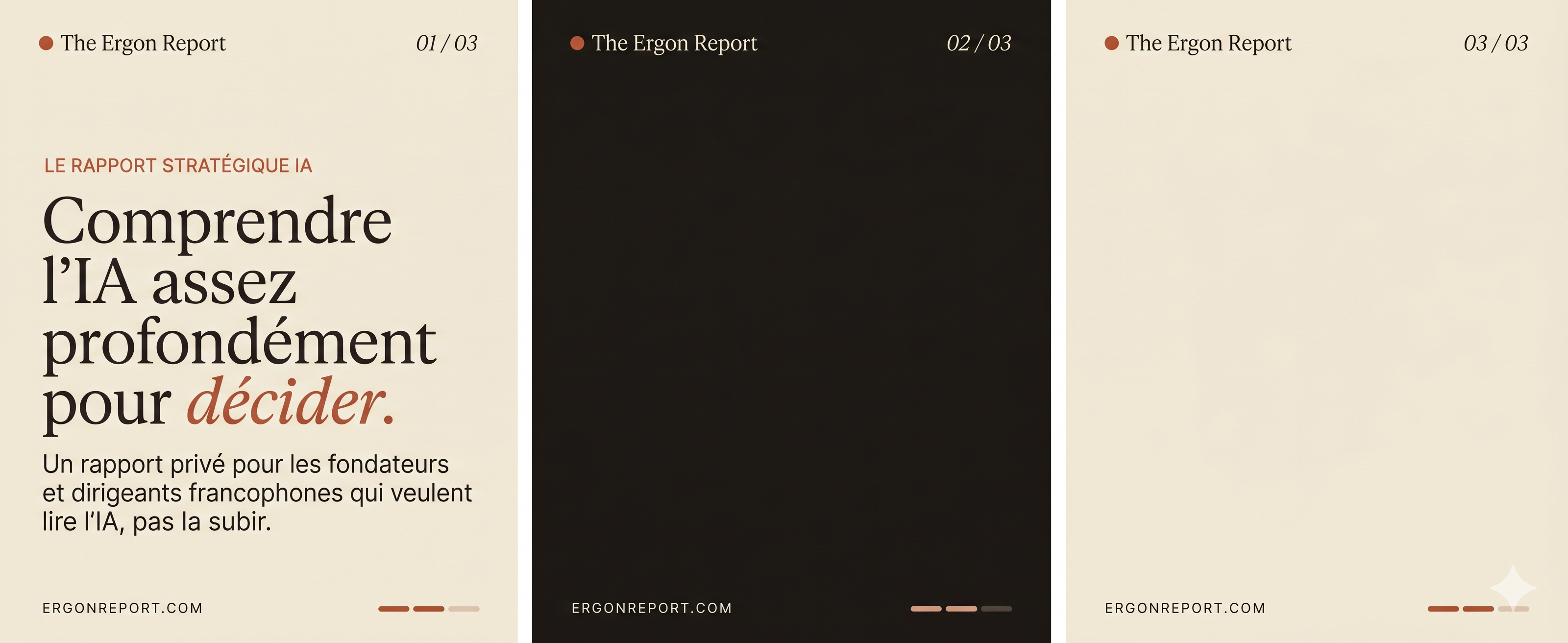
It's pretty, it really is. Believable typography, on-palette colors, clean layout.
Now here's the exact same content produced with the HTML approach I'm about to explain:
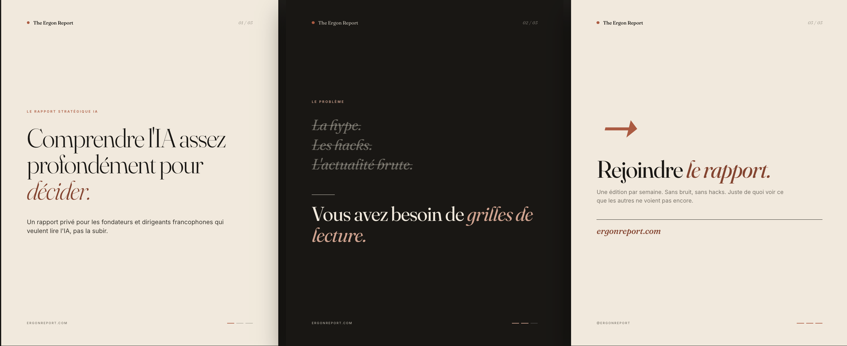
Visually, it's a toss-up. The HTML version is a notch more precise (italics where I wanted them, exact colors), and Gemini sometimes adds a grain people like. To the eye, they're about even.
The difference becomes brutal as soon as you iterate.
Changing "grilles de lecture" to "lentilles d'analyse" (roughly "reading grids" to "analytical lenses") on the middle panel: on Gemini, I reran it five times, two minutes per generation, watching some detail shift elsewhere on the other panels each time. With the HTML, I told Claude Code "replace this word in slide 2." Five seconds. Nothing else moved.
Multiply that by the fifteen to twenty corrections of a real carousel, then by fifty posts a year. The difference isn't measured in minutes anymore, but in half-days and API bills. Not to mention scaling up: with HTML, you script fifty carousels in one go. With image gen, you start from scratch every time.
HTML isn't "better" in absolute terms. It's better as soon as you want to iterate or scale up seriously. Which is the situation most of you are in.
How it works, concretely.
You describe your carousel to Claude Code with the prompt below. Claude Code generates a single HTML file containing all your slides stacked vertically, each at exactly 1080x1350 px. You open the file in Chrome.
To export a slide as a PNG: F12 (Dev Tools), click on a <section class="slide"> in the element tree, right-click, "Capture node screenshot." You get a native 1080x1350 px PNG, whatever your screen size.
To iterate, you send your feedback to Claude Code in plain language: "slide 3, make the title 30% bigger, set the hook in terracotta italics." It edits the file in seconds. No risk of another slide quietly changing behind your back.
The prompt to use (adapt it to your brand):
# ROLE
You are an expert editorial designer. You will create an Instagram carousel
of [N] slides in 1080x1350 px format (4:5 ratio).

# BRAND
Name: [...]
Audience: [...]
Tone: [...]
Visual world (3 references): [e.g. Stratechery, Monocle, Aesop]

# ART DIRECTION
Palette: [3 to 5 colors, ideally with hex codes]
Typefaces: [display serif + body sans-serif,
            e.g. Fraunces 300/400 italic + Inter 400/500]
Mood: [e.g. premium editorial, printed magazine, airy layout]

# TECHNICAL ARCHITECTURE
- A single self-contained HTML file (HTML + CSS + JS inline)
- Each slide = a <section class="slide"> with exact dimensions
  1080x1350 px (never flex-grow, never percentages)
- Slides stacked vertically with a 60 px gap, dark gray page
  background so they stand out visually
- A "Slide X/N" label in white above each slide
- Google Fonts imported in the <head>
- Subtle scroll animations via IntersectionObserver
  (fade + 20 px slide-up, staggered across elements)
- On each slide: a "mast" at the top (brand name on the left,
  slide number on the right), a "footer" at the bottom
  (URL on the left, progress bar on the right)

# CONTENT
Slide 1 (HOOK): short eyebrow, strong 5 to 12 word title, subtitle
  [your content here]
Slide 2 (THESIS): title, 2 short paragraphs
  [your content here]
Slide 3 (TENSION): struck-through list of 3 items, large answer line
  [your content here]
Slide 4 (STRUCTURE): title, 3 items numbered in Roman numerals
  [your content here]
Slide 5 (WHO IT'S FOR): title, 4 to 5 tags, social proof line
  [your content here]
Slide 6 (CTA): strong visual element (arrow), title, URL
  [your content here]

# QUALITY CONSTRAINTS
- A single dominant element per slide (clear typographic hierarchy)
- Side padding of 80 to 100 px, generous vertical spacing
- Alternate light and dark backgrounds for visual rhythm
- Italics in the accent color on 1 to 2 key words per slide
- Subtle graphic details: slide numbers in italics,
  thin rules, typographic accents
- No external libraries except Google Fonts

Generate the complete .html file, ready to open in Chrome.
Adapt it to your brand, your audience, your palette. Try it this week. And see what a browser can produce when you take it seriously.
See you next Wednesday, Salim
P.S. Remember, I almost made a CHF 250,000 mistake in this story. And believe me, it's not the only one I could have made. Understanding AI deeply enough not to get this kind of trade-off wrong is exactly what I dig into in The Ergon Report, for people who make important decisions. It's right here.
Get The Ergon Brief every week